
Yellow and Purple: the rare complementary color harmony.
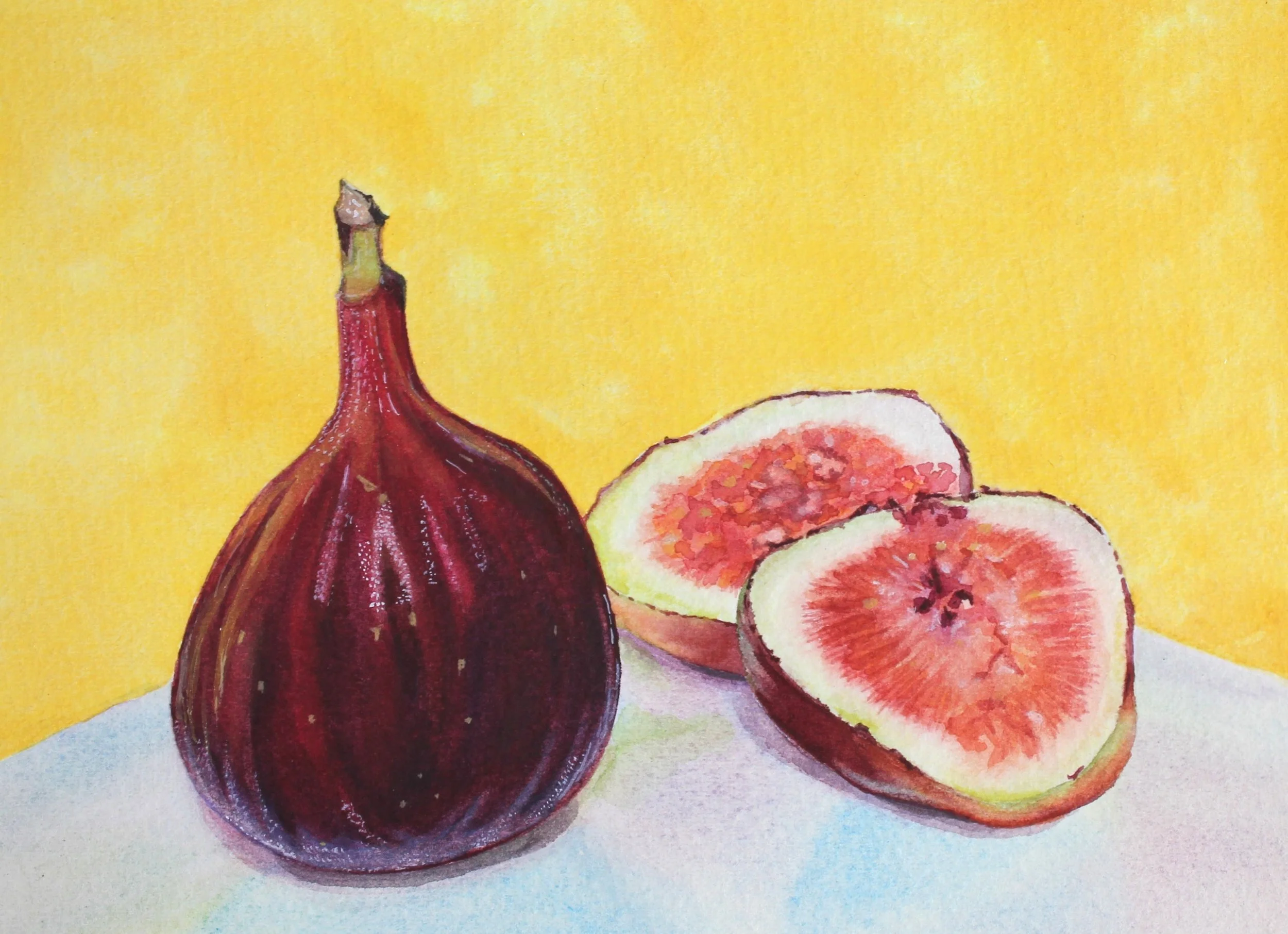
Figs Against a Yellow Wall (Valentina Urrutia Guada, 2025)
For centuries, artists and scientists experimented with colors to discover harmonies, perception and visual effects; resulting in the body of knowledge covered now days by Color Theory.
There are three primary colors in the traditional color model: yellow, red and blue, that can be mixed in pairs to generate 3 secondary colors: orange, green and purple. In each case, the primary that is not used to create a given secondary color is considered the complementary to that secondary color: orange and blue, green and red and purple and yellow. These colors create high contrast and visual impact when used in a painting.
Paul Cezanne’s Still Life with Milk Jug and Fruit is an excellent example of the use of orange and blue, whereas Vincent van Gogh’s A Crab on its Back is an excellent example of the effect obtained through contrasting red and green.
I used the “Extract Color Theme” feature from Adobe Color, a web-based free tool for the creation of palettes to quickly visualize the palettes from each of the paintings below. The extracted themes, using the colorful method, and the placement of these colors in the color wheel (red green blue mode) were modified to create the representations below.
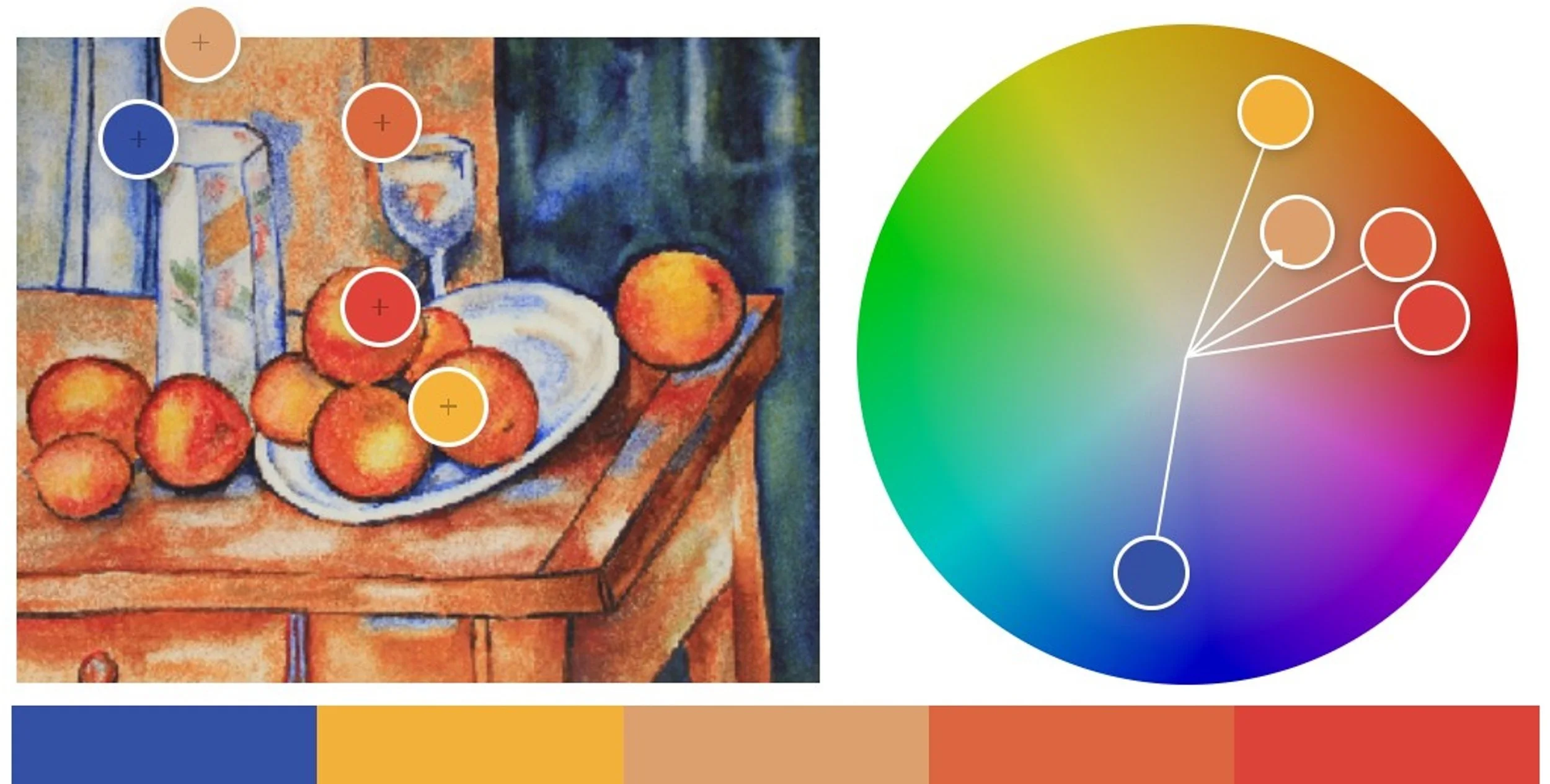
Complementary colors blue and orange are the palette of this recreation of Paul Cezanne’s Still Life with Milk Jug and Fruit

Complementary colors green and red are the palette of this recreation of Vincent van Gogh’s A Crab on its Back
After recreating these paintings I searched for other good examples of artwork that uses complementary colors harmony and realized that yellow and purple is not commonly used.
It could be speculated that the reason is the rarity of the colors in the world, given that blue and green are by far more abundant in nature than purple or yellow. Another reason could be the availability of purple pigments, which was historically very low and of limited use by those in power, although it could still be obtained through mixing more affordable primaries. Another reason could be the psychology of these two colors.
The Figs Against a Yellow Wall was originally inspired by the idea of using these complementary colors. In retrospective, the soft blue and red tones might be more predominant in the painting than the purple, resulting in a triad color harmony.

Figs Against a Yellow Wall is an attempt to use purple and yellow palette, but red tones and blue are also prevalent in the painting, resulting in a triad color harmony instead of a complementary one.
All and all I am simultaneously happy with the painting and feel challenged to keep exploring ideas until I create an artwork that successfully uses the ever evasive yellow-purple complementary color harmony.