
Phthalo Blue’s Blockbuster Monologue
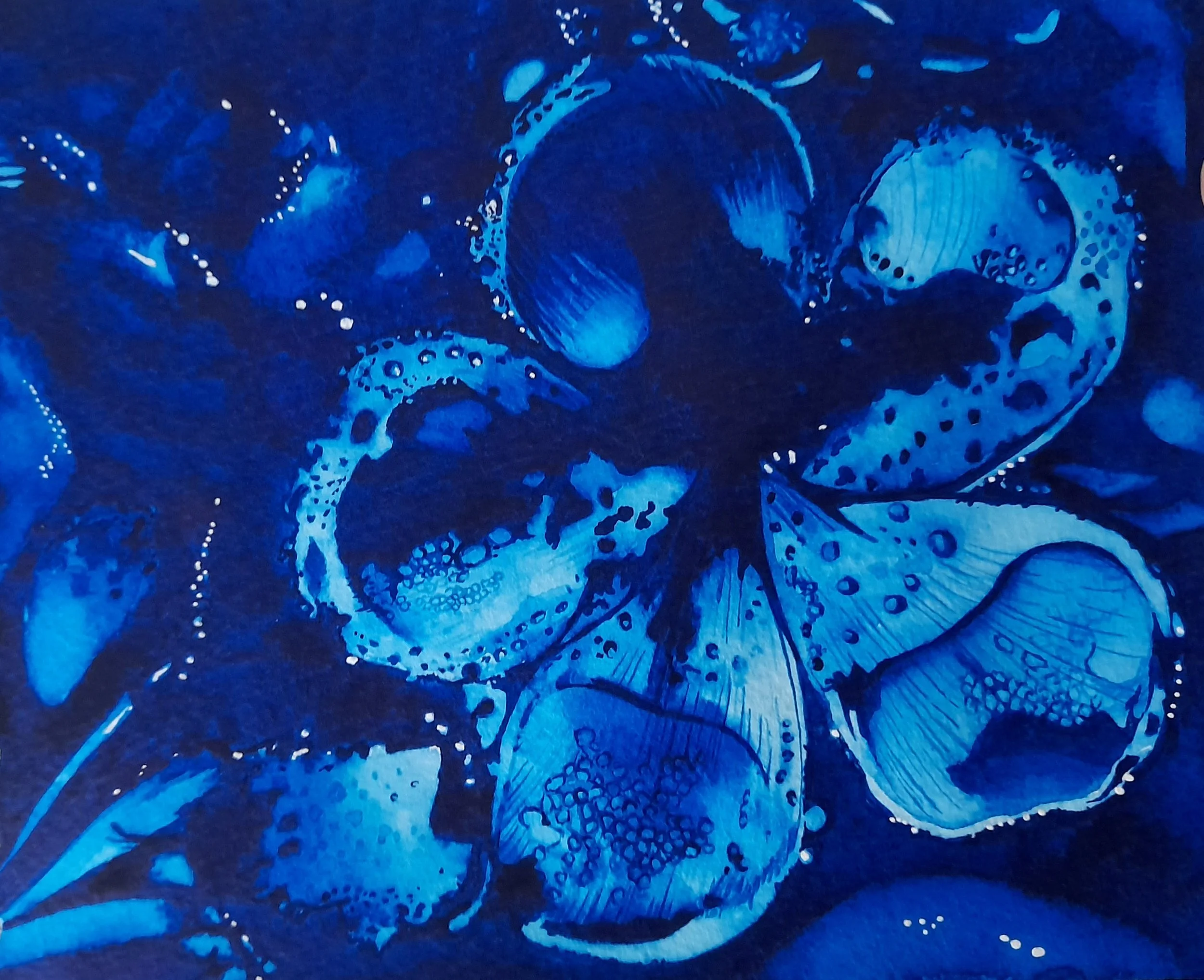
Fountain Frangipani (Valentina Urrutia Guada, 2025). A monochromatic painting made using Phthalo Blue Green Shade by Winsor & Newton.
Sometimes that paint you shy away from is just the right choice for a painting. This is what I experienced with Phthalo Blue when creating the monochromatic painting Fountain Frangipani.
Phthalo Blue (aka phthalocyanine blue) is a bright synthetic pigment with high tinting strength. It is staining, transparent and lightfast.
This affordable pigment has been available for nearly a century and is offered by most watercolor manufacturers worldwide (see examples below) .
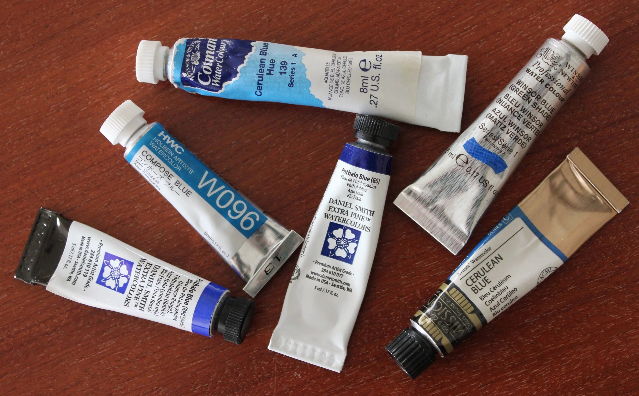
Phthalo Blue is a standard pigment used in paints offered by Winsor & Newton, Daniel Smith, Mijello, Holbein and others.
Occasionally manufacturers offer watercolor paints made with this pigment mixed with white (e.g. Compose Blue by Holbein) or in very low concentration (e.g. Cerulean Blue Hue, Cotman). These options appear easier to use when mixing because they do not overpower other paints; although I would stay away from these paints because of their lower transparency and altered handling properties.
Phthalo Blue comes in different varieties (e.g. PB15, PB15:1, PB15:3, PB15:6) resulting from structural differences that create different shades. The green shade (e.g. PB15:3) is a staple in watercolor starter sets and split primary palettes (see figure below).
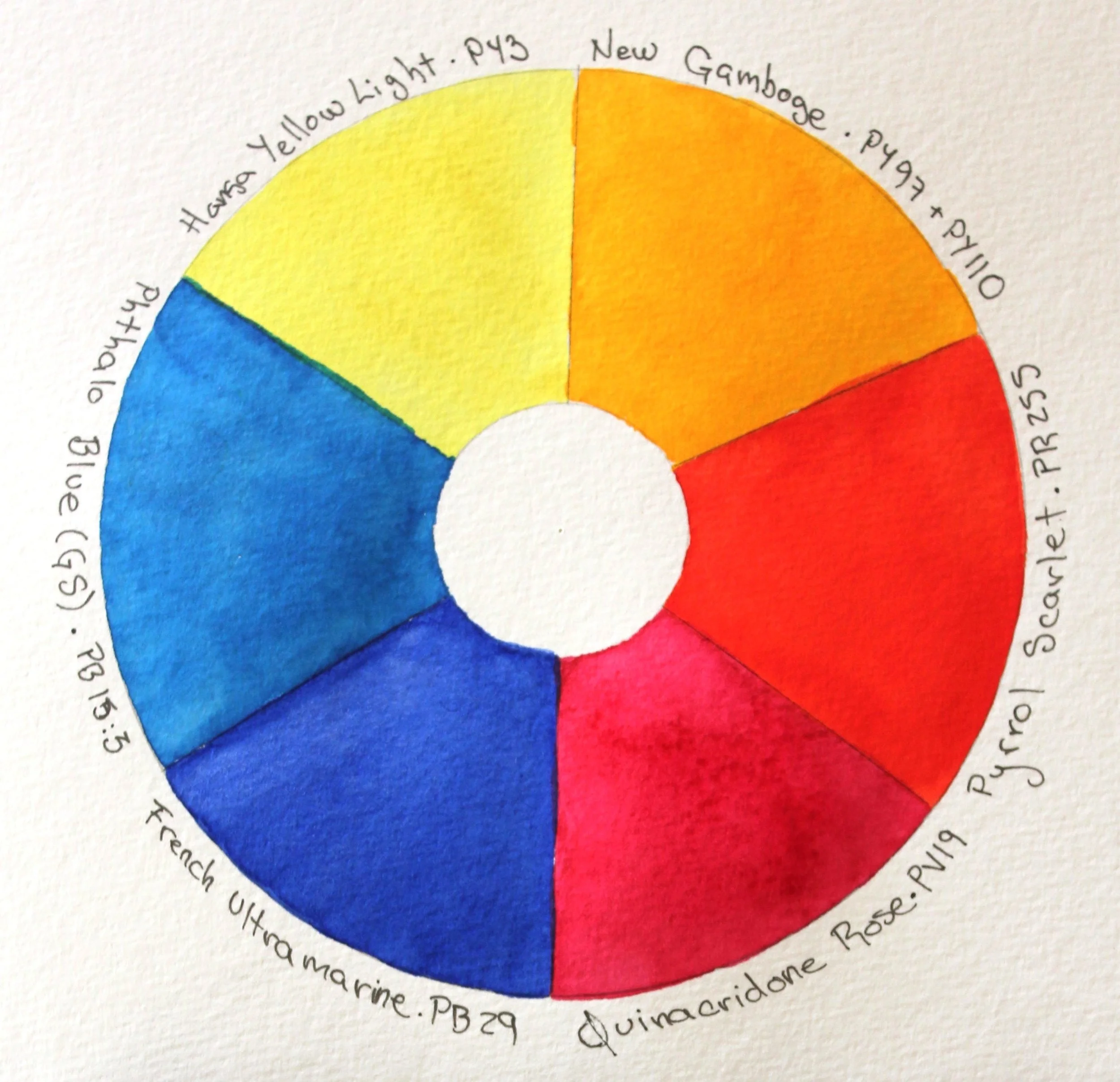
The Daniel Smith Essentials set includes Phthalo Blue (Green Shade) (PB15:3), French Ultramarine (PB29), Quinacridone Rose (PV19), Pyrrol Scarlet (PR255), New Gamboge (PY97 and PY110), and Hansa Yellow Light (PY3)
Phthalo Blue is very bright and, for that reason, it is rarely used without being neutralized. I recommend this video by Steve Mitchell on how to obtain more natural tones.
I rarely used this paint because it was difficult to obtain flat washes, it was tricky to mix because even very small quantities overpowered other paints, it would stain the paper making it impossible to fully lift, and it stained the plastic palettes, work surfaces and fabrics.
But this paint was just the right choice for the monochromatic painting Fountain Frangipani that required very deep dark tones and bright and lively light tones. I was pleasantly surprised with how easy it was to work with this paint; I could lift and I was able to achieve a variety of values without too much effort. Watch the process in the video below.
In Fountain Frangipani, Phthalo Blue showed me it could take center stage, and deliver, in the way only the bright and bold can.